
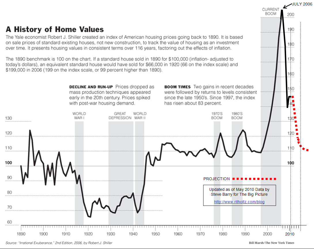
It was updated by a blogger to include a few more years of data. As you can clearly see, the end of a bubble is home prices right about the same as the start. So we are about two thirds the way through the crash. Although prices don't seem to stay at the bottom for long, a couple years is typical. The only long term deviation from this was the great depression.
Edit: I just ran into an article showing a slightly newer version of this graph.
No comments:
Post a Comment